An AQI Colour Is a Public-Health Category, Not Your Personal Exposure Percentage
An air-quality tile can show a number and colour so quickly that you skip the explanation beneath them. Read the category as a communication tool with a defined scale. It is not a percentage of pollution in the air or a measurement of the dose a particular person has breathed during the day.
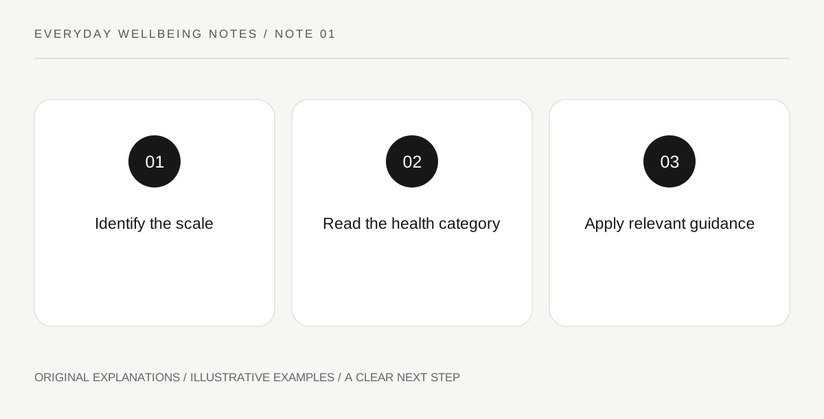
Original explanatory diagram. Read the full method and limitations below.
Identify the index and its location
AirNow explains the U.S. AQI as a colour-coded index connecting outdoor air quality with levels of health concern. Confirm which index a service uses and which location it represents. Do not compare numbers from unnamed systems as if their scales were necessarily identical. Keep the reporting area visible, especially when an app opens a saved location rather than the place where you currently intend to spend time.
Read the category’s words
Look at the category name and the accompanying health guidance, not only whether the tile appears reassuring. Some guidance distinguishes groups that may be more sensitive. Follow relevant professional advice and current local public-health instructions for your circumstances. A category is not a diagnosis, and a person feeling well does not convert the displayed information into proof that exposure is irrelevant to them.
Keep index values separate from concentrations
A pollutant concentration may carry a unit, while an index value maps information onto a communication scale. Write down which quantity a page actually displays before comparing two readings. Do not call an AQI of an illustrative 80 eighty percent pollution, or infer that twice the index means twice an individual’s health effect. Those statements introduce meanings that the displayed number does not establish.
Use the reading to prepare a practical decision
For an ordinary planned outing, consult the current category-specific guidance and identify what arrangement can reasonably change. That might mean discussing the location or timing with the organizer and following your existing health plan. Avoid writing your own universal outdoor-duration limit from the number. Keep the official guidance with the decision so a later screenshot is understandable without reconstructing which colour table you happened to remember.
Illustrative worked example
Illustrative example: A walking-group organizer sees an index tile marked 80 and initially writes that the air is eighty percent polluted. Reading the official explanation corrects the description to the relevant category for the stated location and time. The organizer then shares the official guidance through the group’s normal planning process rather than inventing a personalized exposure limit. The number is an invented teaching example, not a live air-quality report.
Questions that come up
Does a low index guarantee nobody will have symptoms?
No. A public index does not replace individual health advice or establish how every person will respond. Follow your professional guidance and appropriate care instructions for concerning symptoms rather than arguing from the tile alone.
Can I compare two differently labelled air-quality numbers directly?
First establish the index system, pollutant, unit, location and time basis. If those differ, a numerical comparison may answer the wrong question. Keep the labels visible instead of sorting unqualified numbers from smallest to largest.
References and scope
These sources support the factual background. Examples and exercises are original illustrative teaching material. References do not imply endorsement.
- AirNow: AQI basics — AQI category and scale interpretation; not a personalized exposure prescription.